7 most widely used sales reports (with free downloadable templates)


Trying to improve something without data is like walking in a forest without a compass. You can easily get lost, and it’s hard to find the ‘right’ way out. This is also true when assessing your sales process and sales team’s efficiency. If you don’t gather and analyze your data at scale, you won’t know what’s working (or why something isn’t). So, even if you have a small sales team, you should still keep track of your opportunities (both won and lost) to become better at closing deals and boosting revenue.
In this article, you’ll find answers to questions like “what should a sales report look like?” and “what should a sales report include?”. I’ll also share 7 sales report templates that you can download to track and improve your performance.
Table of Contents
7 types of sales reports you can use
In terms of how to create a sales report, it depends on the type of report you’ll use. Here are the main ones along with sales report Excel templates to use.
1. Sales pipeline report
A sales pipeline report shows all your potential deals and where they are in the sales process. It helps businesses track opportunities, forecast revenue, and optimize their sales strategies.
Why use it?
You can use a sales pipeline report to monitor deal progress by tracking how leads move through different stages, from initial contact to closing. It improves forecasting by estimating which deals are likely to close and their value.
But that’s not all, it also helps with spotting bottlenecks, highlighting where deals stall, and allowing teams to address inefficiencies. By diving deeper into these insights, teams can optimize their sales strategies and adjust their tactics to increase conversion rates.
Lev Tretyakov, CEO and Head of Sales of Fortador, told me that they did a pipeline analysis after they noticed that most of their qualified leads silently drifted away without any warning. They left during the education phase before booking a call. The pipeline report showed that prospective clients felt overwhelmed by too much technical content. Their educational material included PSI numbers, fuel efficiency data, and saving rates. These stats were the company’s pride but not all were relevant to the challenges of their clients.
“We simplified our educational materials into quick, actionable videos of our steam cleaners at work. We humanized the rest of the data and introduced one follow-up question, ‘Which of these three outcomes—time saving, cost saving or quality improvement—is most important to you?’. It gave customers a reason to engage with us again and we got a 9% increase in leads from the education phase to scheduled calls,” said Tretyakov.
Key metrics to track
- Number of deals in each stage
- Total pipeline value – the sum of all potential deals
- Win rate – the percentage of deals closed successfully
- Average deal size – the average value of a closed deal or sale over a specific period. It is calculated by dividing the total revenue generated from sales by the number of deals closed
- Sales cycle length – time taken to close deals.
Best practices
- Update regularly – keep data fresh to ensure accurate forecasting
- Segment reports – analyze by product, sales rep, or region for deeper insights. Don’t put all your clients into one basket; segment them instead. At Livespace, we use different sales funnels based on factors like the client’s industry and sales team size. Their buying processes vary– a software house won’t buy the same way as a production firm or a corporation. Treating all clients the same just doesn’t work.
- Review conversion rates – identify weak stages and improve follow-ups.
How to create a sales pipeline report in Excel
Step 1: Set up your data table
Open Excel and create a table with the following columns:
- Deal name – the name of the prospect or deal.
- Creation date – when the deal was created to calculate the average cycle length.
- Company name – that’s self-explanatory
- Contact person – to know who you get in touch with.
- Sales rep – the person responsible for the deal.
- Deal stage – current stage (e.g., Lead, Qualified, Proposal Sent, Negotiation, Closed-Won/Lost).
- Deal value – the estimated revenue from the deal.
- Probability (%) – the likelihood of closing the deal.
- Expected revenue – deal Value × Probability (%).
- Closing date – estimated or actual deal closure date.
Step 2: Input sales data
Enter your deals into the table, filling in each column based on current pipeline data.
Step 3: Use formulas for key metrics
- Total Pipeline Value: =SUM(E:E) (sum of Deal Values)
- Weighted Pipeline Value (Forecasted Revenue): =SUM(F:F) (sum of Expected Revenues)
Win Rate:
=COUNTIF(G:G, “Closed-Won”) / (COUNTIF(G:G, “Closed-Won”) + COUNTIF(G:G, “Closed-Lost”))
- Average Deal Size: =AVERAGEIF(G:G, “Closed-Won”, E:E)
- Sales Cycle Length: Calculate the difference between deal creation and closing dates using =AVERAGE(H:H – B:B).
Step 4: Create a sales pipeline chart
- Select your data (Deal Stages and Deal Values).
- Go to Insert > Bar Chart > Stacked Bar Chart.
- Format the chart to visualize deals in each stage.
Step 5: Apply conditional formatting
Use conditional formatting to highlight high-value deals, stalled deals, or urgent closing deadlines.
If you’d rather not create one yourself, we have ready-made templates for you.
Just leave your email and we will send it directly to your inbox.
2. Conversion rate report
A conversion rate report tracks the percentage of leads that move through each stage of the sales funnel and ultimately become paying customers. It helps businesses see how well their sales process is working, spot weak points, and improve their strategy to close more deals.
Why use it?
In short, if you want to find out how well your sales team is performing, you should look at the conversion rate report. It will come in handy in identifying which stages of the sales funnel need improvement, like lead qualification or proposal. By looking into past conversion trends, you can enhance forecasting and make more accurate revenue predictions.
Adam Yong, Founder of Agility Writer, told me that using a conversion rate report showed him how their content strategy was driving traffic but not necessarily converting that traffic into leads. He realized the disconnect was the lack of clear calls to action and tailored messaging that aligned with user intent.
“After diving deeper into this, I optimized our landing pages and adjusted our email follow-ups. After refining our approach, our conversions improved by 20%. Tracking this metric has been instrumental in ensuring we are not just attracting visitors but turning them into actual clients. Understanding conversion rates gives you a clear view of what’s working and what needs tweaking,” added Yong.
Krzysztof Kowalczyk, Head of Sales at TimeCamp, is also a big advocate of conversion rate reports. He told us that they help the brand check not only how effective their lead conversion strategies are, but also where the biggest challenges in the sales process lie. Kowalczyk says that the sales team examines conversion from several perspectives.
- “Conversion between individual sales stages – this helps identify where we lose potential customers and which stages need optimization.
- Conversion to purchase by salesperson – this helps reveal whether some team members are more effective at handling large clients. If so, we can implement their best practices across the team.
- Conversion to purchase by customer segment (SMBs vs enterprises) – this enables us to tailor our strategy to different customer groups.
- Conversion to purchase over time (quarterly/monthly) – this helps us track sales seasonality and adjust our actions at key moments.”
Kowalczyk also mentioned that he typically conducts these analyses once a month, as the sales cycle ranges from 2 weeks to 3 months.
Key metrics to track
- Lead-to-customer conversion rate: (won deals/total leads) × 100
- Marketing qualified lead to sales qualified lead conversion rate: (number of SQLs/number of MQLs) x 100
- Sales lead to customer: (number of customers/number of sales leads) x 100
- Stage-to-stage conversion rates: percentage of leads progressing through each funnel stage
- Win rate: Percentage of closed deals compared to total opportunities
- Customer acquisition cost (CAC): total sales and marketing spend per acquired customer
- Time-to-conversion: average time taken to convert a prospect into a lead.
Best practices
- Segment data – analyze conversion rates by lead source, sales rep, or region
- Set benchmarks – compare against industry averages or past performance
- Identify drop-off points – improve messaging or follow-ups at weak stages.
How to create a conversion rate report in Excel
Step 1: Set up your data table
Open Excel and create a table with the following columns:
- Stage name – lead stages (e.g., Website Visit, Lead, Qualified, Proposal, Closed-Won).
- Number of leads – total leads at each stage.
- Conversion rate (%) – percentage of leads moving to the next stage.
Step 2: Input sales data
Enter the number of leads at each stage based on your sales funnel data.
Step 3: Apply formulas for key metrics
Stage-to-Stage Conversion Rate:
= (Current Stage Leads / Previous Stage Leads) * 100
Overall Conversion Rate (Lead to Customer):
= (Closed-Won Leads / Initial Leads) * 100
Average Time to Conversion (if tracking lead dates):
=AVERAGE(Closing Date – Lead Creation Date)
Step 4: Create a Funnel Chart
- Select the “Stage Name” and “Number of Leads” columns.
- Go to Insert > Bar Chart > Stacked Bar Chart (adjust to look like a funnel).
- Format the chart to visualize drop-offs at each stage.
Step 5: Apply Conditional Formatting
- Highlight low conversion rates in red to spot weak points.
- Use green for high-converting stages.
3. Sales forecast report
A sales forecast report predicts future sales by looking at past performance, market trends, and current sales efforts. It helps businesses plan and tweak strategies to stay on track.
Why use it?
It allows companies to allocate resources like budgets, staff, and inventory more effectively. By setting realistic goals and identifying potential challenges early, businesses can adjust strategies to stay prepared. Ultimately, a sales forecast report keeps sales efforts aligned with company goals, driving better results as explained by Austin Rulfs, the director of Zanda Wealth Mortgage Brokers.
By examining their sales forecast report, they spotted a bottleneck between the initial consultation and the loan application. Many potential clients sought information but did not proceed, which surprised him as he believed that their consultation sessions were comprehensive. This discovery led to a change.
“Our consultation process now delivers unique application step plans to every individual client. Periodic check-in meetings now provide clients with assistance. The added loan application completion process led to both increased customer satisfaction and higher organizational revenue levels. As a business owner and investor, I believe sales forecasts are more than just numbers but they tell a story. They reveal your current situation and potential future,” added Rulfs.
Key metrics to track
- Total forecasted sales – the revenue a business expects to make in a given period based on past sales and current trends
- Historical sales data – information about past sales, like revenue and deal details, that helps businesses spot trends and make smarter predictions for the future
- Pipeline stage conversion rates – the percentage of leads that move from one step of the sales process to the next
- Average deal size – the typical value of a closed sale, calculated by dividing total revenue by the number of deals
- Time to close – the average time it takes to turn a lead into a customer, from the first contact to the deal’s completion.
Best practices
- Use accurate data – base your forecast on historical sales data, current pipeline information, and market trends to ensure accuracy
- Segment your data – break down the forecast by product, region, or sales team to gain more granular insights
- Set clear assumptions – define the factors influencing the forecast (e.g., seasonality, economic conditions) to clarify how estimates are made
- Incorporate sales stages – track deals through various pipeline stages (e.g., prospecting, negotiation) to better understand conversion likelihood
- Collaborate with sales teams – get input from your salespeople, as they have first-hand knowledge of potential deals and can offer valuable insights
- Update regularly – revise forecasts periodically to reflect new data, trends, or shifts in the market.
How to create a sales forecast report in Excel
Step 1: Set up your columns
- Column A: Date (e.g., months, quarters)
- Column B: Forecasted Sales (estimated revenue per period)
- Column C: Historical Sales (actual sales from previous periods)
- Column D: Difference (Forecasted Sales – Historical Sales)
- Column E: Adjusted Forecast (to account for market changes)
Step 2:Enter data
- Input historical data in the Historical Sales column.
- Forecast future sales in the Forecasted Sales column using historical trends or data-driven methods (e.g., growth percentages or average sales per month).
Step 3: Add Formulas
- Difference: In column D, calculate the difference between forecasted and actual sales using the formula =B2-C2.
- Adjusted Forecast: In column E, if needed, adjust the forecast based on any market condition changes (e.g., if market conditions change by 5%, you can adjust by multiplying the forecasted value by 1.05).
Step 4: Visualization:
- Highlight your data and create a line chart or bar chart to visualize trends and forecast accuracy.
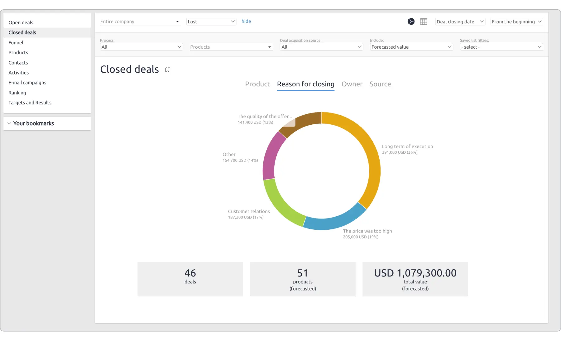
4. Deals won/deals lost
A deals won/deals lost report provides a breakdown of all closed deals, clearly distinguishing between successful sales (deals won) and unsuccessful attempts (deals lost). This report makes it easier to spot and analyze the factors that influence deal outcomes.
Why use it?
This sales report is a must because it lets you identify patterns that either contribute to (or block) a sale. As a result, you and your team can improve your sales strategy – for example, enhance your value proposition, sales pitch, or even refine your lead qualification criteria. While it’s not a sales forecast report, per se, it also hints at your possible sales win rate with your existing strategy.
Arsen Misakyan, Founder of LAXcar, told me that this report has been a game-changer for his company’s sales process. “After tracking the reasons behind every deal outcome closely, we realized that a big chunk of our lost deals – around 30-35% – were simply due to misaligned expectations relating to our premium service lines and timing,” Misakyan explained. He said that numerous prospects went with competitors who could provide higher responsiveness for service changes or flexible pricing in peak periods.
Using this data, LAXcar made some critical changes. First, they overhauled the company’s sales training to make sure they could better articulate the brand’s unique value proposition and better handle potential pricing objections during the sales process. “We also rolled out an optional scheduling service during peak times to meet the menu-matching concerns raised by our report. Consequently, over the next quarter, our win rate increased by 22% and customer satisfaction scores mirrored this improvement”, Misakyan said. Not only did this report show the sales team where they were slipping. It also offered straightforward stats that inspired changes on how to anticipate their clients’ needs better.
Key metrics to track
- Deals won – the total number of deals closed successfully
- Deals lost – the total number of deals lost during the sales process
- Win rate – the percentage of deals that result in a successful close
- Loss rate – the percentage of deals that are lost
- Average deal size (won) – the average value of deals that were successfully closed
- Average deal size (lost) – the average value of deals that were lost
- Reason for loss – the key reasons why deals are lost (e.g., price objections, competition, lack of urgency).
Best practices
- Categorize deal outcomes – on top of creating two main categories, i.e., deals won and deals lost, also track the reasons for each opportunity
- Update your data regularly – this will let you track how your changes impact deal outcomes
- Identify patterns – look for trends in deal losses to identify common obstacles
- Track deals won/lost by sales representative – if you’re using a sales report Excel file, create a separate column for each sales person. Analyze their performance to pinpoint areas for improvement.
- Use visuals – on top of charts for win/loss rations or trends in deal sizes, I particularly recommend creating graphs like pie charts for reasons for loss.
How to create a deals won/deals lost report in Excel
Step 1: Enter data in a table format
Open Excel and create a table with the following columns:
- Deal name – the name of the deal or customer
- Sales rep – the person responsible for closing the deal
- Deal value – the value of the deal in terms of revenue
- Deal stage – the current stage of the deal (e.g., Proposal Sent, Negotiation, Closed-Won, Closed-Lost)
- Close date – the date the deal was closed
- Deal outcome – the result of the deal (e.g., Closed-Won, Closed-Lost)
- Reason for loss – if applicable, the reason the deal was lost (e.g., Price, Competition, Timing, Lack of Interest).
Step 2: Add formulas for key metrics
Once your table is set up, use formulas to calculate essential metrics for deals won and deals lost:
- Total deals closed – the total number of deals closed in the reporting period.
- Formula: =COUNTIF(E2:E100, “Closed-Won”) + COUNTIF(E2:E100, “Closed-Lost”) (assuming deal outcomes are in column E).
- Deals won – the total number of deals marked as “Closed-Won.”
- Formula: =COUNTIF(E2:E100, “Closed-Won”).
- Deals lost – the total number of deals marked as “Closed-Lost.”
- Formula: =COUNTIF(E2:E100, “Closed-Lost”).
- Win rate – the percentage of deals won.
- Formula: =COUNTIF(E2:E100, “Closed-Won”) / (COUNTIF(E2:E100, “Closed-Won”) + COUNTIF(E2:E100, “Closed-Lost”)) * 100.
- Loss rate – the percentage of deals lost.
- Formula: =COUNTIF(E2:E100, “Closed-Lost”) / (COUNTIF(E2:E100, “Closed-Won”) + COUNTIF(E2:E100, “Closed-Lost”)) * 100.
- Average deal size (won) – the average value of deals that were closed successfully.
- Formula: =AVERAGEIF(E2:E100, “Closed-Won”, C2:C100) (assuming deal values are in column C).
- Average deal size (lost) – the average value of deals that were lost.
- Formula: =AVERAGEIF(E2:E100, “Closed-Lost”, C2:C100) (assuming deal values are in column C).
Step 3: Create a win/loss performance chart in Excel
- Select data for the chart
- Highlight the “Deal Outcome” and “Deal Value” columns.
- Insert a chart
- Go to Insert → Click on Column or Pie Chart → Select a suitable chart (e.g., a pie chart to show the ratio of deals won vs. lost).
- Customize the chart
- Click on the chart and use Chart Design tools:
- Add data labels to show deal counts and values
- Use contrasting colors to differentiate between deals won and lost
- Adjust axis labels and titles for clarity.
- Click on the chart and use Chart Design tools:
Step 4: Add summary metrics
To summarize your win/loss performance, create summary calculations for key metrics:
- Total deals closed – the total number of closed deals (both won and lost).
- Deals won (%) – the percentage of deals won.
- Deals lost (%) – the percentage of deals lost.
- Average deal size (won) – the average value of won deals.
- Average deal size (lost) – the average value of lost deals.
Use formulas like COUNTIF(), AVERAGEIF(), and basic mathematical operations to calculate these metrics automatically.
Step 5: Automate with conditional formatting
- Highlight won deals in green for positive reinforcement.
- Use red formatting for lost deals to emphasize areas of improvement.
- Apply data bars to visualize deal values and quickly spot the highest-value deals won or lost.
5. Average deal size
An average deal size report lets you calculate the typical value of a closed deal. It applies to both won and lost sales opportunities, allowing you to understand the financial impact of your sales efforts. This report is especially valuable if you want to check how well your sales reps are doing at successfully closing higher-value deals.
Why use it?
Keeping track of your deals’ average value lets you check if you’re targeting the right customers and whether your existing pricing strategy is effective. This lets you apply improvements in your sales pipeline and strategy and, ultimately, increase profitability from deals.
Also, knowing the average deal size helps you forecast your revenue and prioritize the highest-value deals to maximize your revenue.
One of the industries where average deal size reports serve as a vital financial resource is real estate.
Sebastian Wade, a Real Estate Consultant at Eden Emerald Mortgages, told me that such reports help him understand both which types of properties clients usually seek and how his company can measure up to market expectations.
“When I look at my own sales reports, I track how many high-value homes we close on each month”, he said. “If I see that the average deal size has increased, it indicates that I’m successfully targeting more premium markets, which usually come with a higher level of service and more competitive financing options. Conversely, if the average deal size drops, I can reassess the types of properties I’m focusing on and adjust my strategy accordingly”. Wade explained that these sales reports allow him to adapt quickly to shifts in the market and adjust his sales approach to maintain consistent performance.
Key metrics to track
- Total revenue – the total revenue generated from all closed deals within a given period
- Total deals closed – the total number of deals successfully closed during the reporting period
- Average deal size – the average value of closed deals, calculated as total revenue / total deals closed
- Deal size distribution – breakdown of deals by size (e.g., small, medium, large) to identify trends in deal value
- Win rate by deal size – the conversion rate for deals in different size categories (e.g., small, medium, large)
- Revenue per sales rep – the average deal size achieved by each sales representative.
Best practices
- Segment deals by value – this can help you understand trends and deal distribution more accurately
- Compare efficiency over time – track average deal size over different periods to identify trends and assess whether sales strategies are improving deal values. Make sure to compare similar time periods.
- Analyze sales rep performance – Knowing which sales reps are best at closing higher-value deals matters not because they can train or support lower-performing team members. You can also assign them to your highest-value accounts
- Keep an eye out for external factors – consider everything that can impact a spike or drop in average deal size. These include market changes and seasonality.
How to create an average deal size report in Excel
Step 1: Enter data in a table format
Open Excel and create a table with the following columns:
- Deal name – the name of the deal or customer.
- Sales rep – the person responsible for closing the deal.
- Deal value – the value of the deal in terms of revenue.
- Deal stage – the current stage of the deal (e.g., Proposal sent, Negotiation, Closed-won, Closed-lost).
- Close date – the date when the deal was closed.
- Deal outcome – the result of the deal (e.g., Closed-won, Closed-lost).
Step 2: Add formulas for key metrics
Once your table is set up, use formulas to calculate essential deal metrics:
- Total revenue – the sum of all deal values closed in the reporting period.
- Formula: =SUM(C2:C100) (assuming deal values are in column C).
- Total deals closed – the total number of deals marked as “Closed-Won.”
- Formula: =COUNTIF(E2:E100, “Closed-Won”) (assuming deal outcomes are in column E).
- Average deal size – the average value of all closed deals.
- Formula: =AVERAGEIF(E2:E100, “Closed-Won”, C2:C100) (this calculates the average deal value for only closed deals).
- Revenue per deal – the average revenue per deal across the period.
- Formula: =SUM(C2:C100) / COUNTIF(E2:E100, “Closed-Won”)
Using these formulas, Excel will automatically calculate the total revenue, total closed deals, and the average deal size whenever new data is entered.
Step 3: Create a deal size performance chart in excel
- Select data for the chart
- Highlight the “Deal value” and “Deal outcome” columns.
- Insert a chart
- Go to Insert → Click on Column or Pie Chart → Select a suitable chart (e.g., a bar chart to compare deal sizes).
- Customize the chart
- Click on the chart and use Chart Design tools:
- Add data labels to show the deal values.
- Use contrasting colors for easy comparison of different deal sizes.
- Adjust axis labels for better readability.
- Click on the chart and use Chart Design tools:
Step 4: Add summary metrics
To summarize your deal size performance, add the following calculations:
- Total revenue – the total revenue generated from closed deals.
- Average deal size – the average deal value.
- Number of closed deals – the total number of deals marked as “Closed-Won.”
- Revenue per sales rep – the average revenue per deal closed by each sales rep.
Use formulas like SUM(), COUNTIF(), and AVERAGE() to calculate these metrics automatically.
Step 5: Automate with conditional formatting
- Highlight large deals (e.g., over $50,000) in green to make them stand out.
- Use red formatting for low-value deals (e.g., under $5,000).
- Apply data bars to visualize the range of deal values, allowing you to quickly spot high or low-value deals.
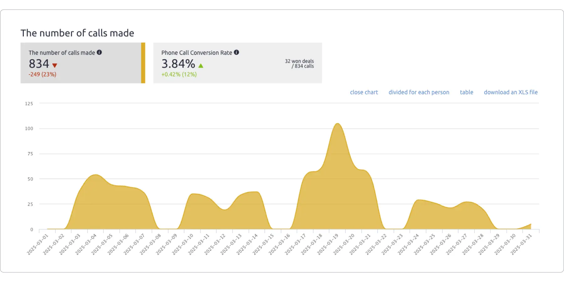
6. Sales calls report
A sales calls report tells you how effective your phone-based sales outreach efforts are. You track key call-related metrics such as volume, duration, and outcomes. This hints at how effective your sales team is at selling via voice channels and how they can engage better with prospects.
Why use it?
Tracking sales calls is an absolute must, even if you use a mix of sales acquisition channels. It allows you to evaluate your team’s outreach effectiveness and measure conversion rates from this contact method.
This sales report helps you spot trends in prospect engagement. If you understand the reasons for lead drop out, you can use them to improve follow-up strategies and refine your company’s pitch and messaging. I believe that this report is extremely valuable for the entire company (not only for those who run phone-based outreach), because you gather feedback directly from potential clients. These findings can then be used to improve your entire outreach strategy.
From a team operational standpoint, sales call reports can help you adjust call frequency, balance workload distribution, and prioritize high-value prospects for maximum impact.
Key metrics to track
- Total calls made – the number of sales calls completed within a given period
- Call duration – the average length of each sales call
- Conversion rate – the percentage of calls that result in a desired action (e.g., scheduled demo, closed deal)
- Follow-up rate – the percentage of calls requiring further engagement
- Win rate – the percentage of calls that result in bringing leads into the sales funnel
- Response rate – the percentage of prospects who answer or return sales calls
- Average calls per deal – the number of calls typically needed to close a sale.
Best practices
- Standardize call logging – make sure all of your sales reps fill out a call record file. This will help keep data consistent (and as a result maintain accurate reporting)
- Track call outcomes – categorize results (for example, with tags like interested, follow-up required, not interested) to identify trends
- Analyze call performance over time – compare past and present call data to track improvements and refine strategies
- Segment reports by sales rep, region, or lead type – This applies particularly to bigger teams, distributed across numerous markets. Segmenting reports this way will let you gain deeper insights based on specific categories and criteria.
How to create a sales calls report in Excel
Step 1: Enter data in a table format
Open Excel and create a table with the following columns:
- Date – the date of the sales call.
- Sales rep – the person responsible for the call.
- Prospect name – the name of the potential customer.
- Company name – the organization the prospect belongs to.
- Call duration (minutes) – the length of the call.
- Call outcome – the result of the call (e.g., interested, follow-up required, not interested).
- Next steps – any actions required after the call (e.g., send proposal, schedule demo, or no further action).
Step 2: Add formulas for key metrics
Once your table is set up, use formulas to calculate essential sales call metrics:
- Total calls made – the total number of calls recorded.
- Formula: =COUNT(A2:A100) (assuming dates are in column A).
- Average call duration – the average length of all calls.
- Formula: =AVERAGE(E2:E100) (assuming durations are in column E).
- Conversion rate (%) – the percentage of calls resulting in a successful outcome.
- Formula: (Number of Successful Calls / Total Calls) * 100
- Example: If 20 out of 100 calls led to a sale or demo, the conversion rate is (20 / 100) * 100.
- Follow-up rate (%) – the percentage of calls requiring further action.
- Formula: (Number of Follow-up Calls / Total Calls) * 100
- Example: If 30 out of 100 calls require follow-ups, the follow-up rate is (30 / 100) * 100.
Using these formulas, Excel will automatically update the metrics whenever new data is added.
Step 3: Create a sales calls performance chart in Excel
- Select data for the chart
- Highlight the “Call Outcome” and “Number of Calls per Outcome” columns.
- Insert a chart
- Go to Insert → Click on Column or Pie Chart → Select a suitable chart to visualize call outcomes.
- Customize the chart
- Click on the chart and use Chart Design tools:
- Add data labels to show numbers.
- Change colors for better visualization.
- Adjust axis labels for readability.
- Click on the chart and use Chart Design tools:
Step 4: Add summary metrics
To gain deeper insights into sales call performance, create summary calculations for key metrics:
- Total calls made – the sum of all recorded calls.
- Successful calls (%) – the percentage of calls leading to a positive outcome.
- Average call duration – the typical time spent on each call.
- Follow-up rate (%) – the percentage of calls requiring further action.
- Deal closing rate (%) – the percentage of calls that convert into closed deals.
Use formulas like SUM(), AVERAGE(), and basic multiplication to calculate these metrics automatically.
Step 5: Automate with conditional formatting
- Highlight short calls (<2 min) in red to identify ineffective calls.
- Use green formatting for calls with successful outcomes.
- Apply Data Bars to visualize call durations and outcomes at a glance.
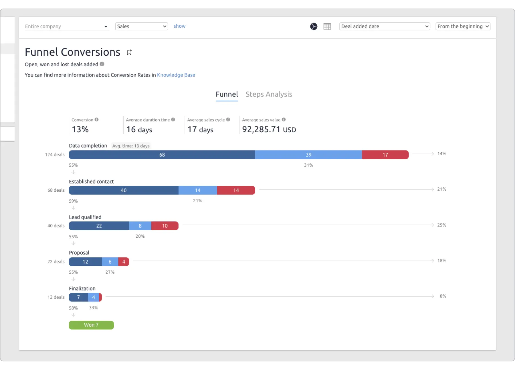
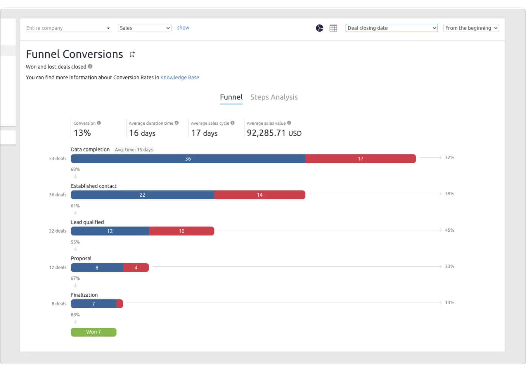
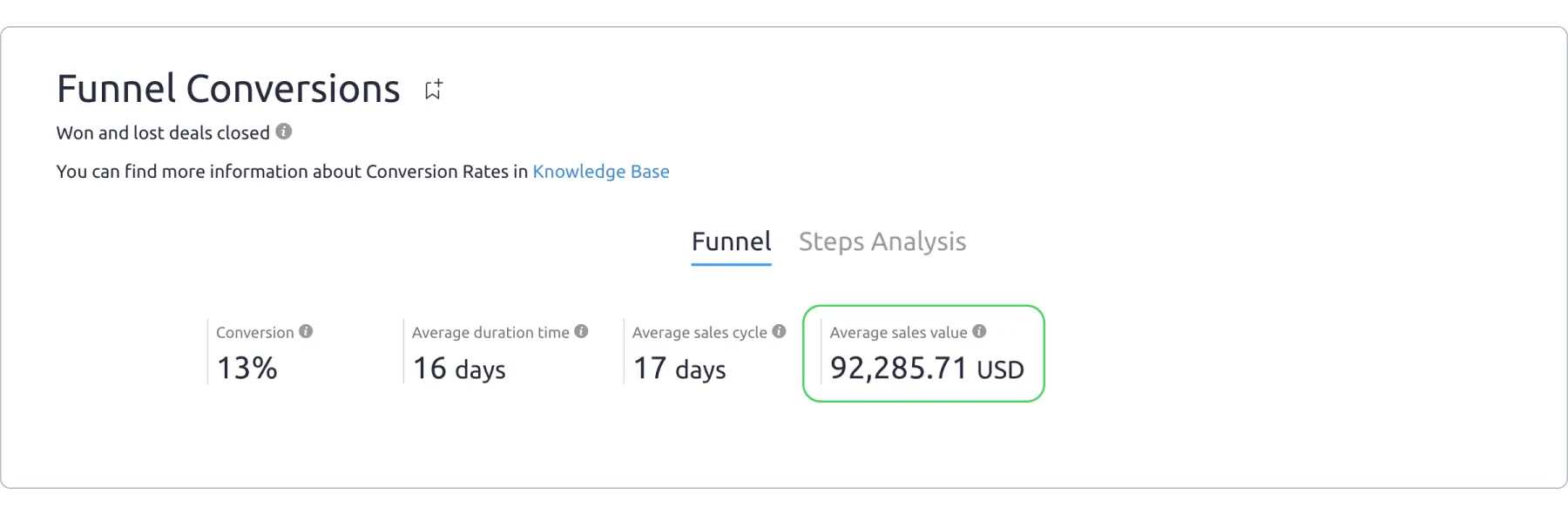
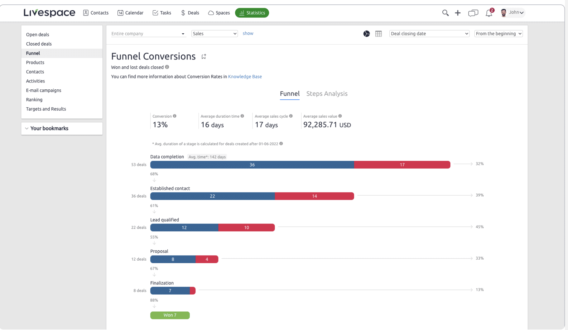
7. Sales funnel report
A sales funnel report shows how leads progress through each stage of the sales process, from initial contact to final conversion. It helps businesses understand where prospects drop off and which stages need improvement to boost sales performance.
Why use it?
Tracking your sales funnel with this report lets you see the number of deals progressing through each stage. As you analyze how your leads proceed and where they drop-off, you can spot patterns in customer behavior and understand your team’s potential inefficiencies.
You can use findings from this type of report for a variety of improvements. For example, to refine your outreach approach, the frequency of your follow-ups, and allocate your best-performing sales reps to your highest-value deals.
Zoe Rice, Marketing Manager at 3 Men Movers, told me that she uses sales funnel reports to see how inquiries get converted to bookings and how the brand can improve their overall business performance.
She shared a story of an incident where, while analyzing the sales funnel report for her company, she discovered many potential clients dropping off during the initial inquiry stage. “It indicated that our initial communication wasn’t engaging enough to convert inquiries into bookings”, Rice said. “I suggested several changes, and as a result, our bookings improved significantly”. Among others, she suggested revamping the inquiry response template to make it more personalized and informative. Rice also restructured the follow-up process and added more customer testimonials on the brand’s website (and more marketing materials) to build trust and credibility.
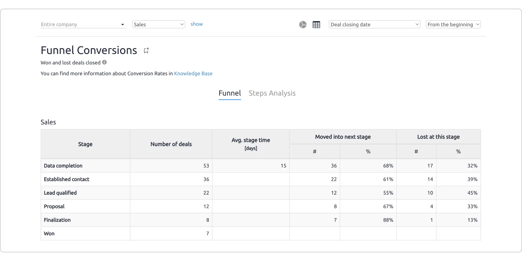
Key metrics to track
- Total leads entering the funnel – the number of prospects at the top of the funnel
- Lead conversion rates – the percentage of leads that move from one stage to the next
- Sales cycle length – the average time it takes for a lead to become a paying customer
- Win rate – the percentage of deals closed successfully
- Customer acquisition cost (CAC) – the cost of acquiring a new customer
- Revenue per lead – the average revenue generated per lead
- Drop-off rates – the percentage of leads that exit the funnel at each stage.
Best practices
- Define clear stages – ensure the funnel is structured with well-defined stages (e.g., Lead → Qualified Lead → Proposal → Closed Deal)
- Regularly update data – keep reports accurate with real-time updates to reflect the latest sales activities
- Segment reports by criteria – break down data by product, industry, sales rep, or marketing channel for deeper insights
- Use visualization tools – use charts, graphs, and dashboards to quickly interpret trends
- Compare performance over time – analyze historical data to identify improvement areas.
How to create a sales funnel report in Excel
Step 1: Enter data in a table format
Open Excel and create a table with the following columns:
- Funnel stage – represents different phases of the sales process (e.g., Website Visitors, Free Trial Sign-ups, Product Demos Scheduled, Proposals Sent, Closed-Won Deals).
- Leads count – the number of prospects at each stage.
- Conversion rate (%) – the percentage of leads that move from one stage to the next.
- Drop-off rate (%) – the percentage of leads that exit the funnel at each stage.
- Avg. time in stage (days) – the average time a lead spends in each stage.
Step 2: Add formulas for key metrics
Once your table is set up, use formulas to calculate essential sales metrics:
- Conversion rate (%) – the percentage of leads moving to the next stage.
- Formula: (Next Stage Leads / Previous Stage Leads) * 100
- Example: To calculate the conversion rate for “Free Trial Sign-ups,” divide the number of sign-ups by the number of website visitors.
- Drop-off rate (%) – the percentage of leads lost at each stage.
- Formula: 100 – Conversion Rate
- Example: If the conversion rate from website visitors to free trials is 5%, the drop-off rate is 95%.
- Total funnel conversion rate – the percentage of initial leads that become paying customers.
- Formula: (Final Stage Leads / First Stage Leads) * 100
- Example: If 50,000 visitors generate 150 closed deals, the total funnel conversion rate is (150 / 50,000) * 100.
Using these formulas, Excel will automatically update metrics whenever new data is added.
Step 3: Create a funnel chart in Excel
- Select data for the funnel chart
- Highlight the “Funnel Stage” and “Leads Count” columns.
- Insert a funnel chart
- Go to Insert → Click on Waterfall & Stock Chart → Select Funnel Chart.
- Customize the chart
- Click on the chart and use Chart Design tools:
- Add data labels to show the lead counts.
- Change the colors for better visualization.
- Adjust axis labels for readability.
- Click on the chart and use Chart Design tools:
Step 4: Add summary metrics
To get a clear view of sales performance, create summary calculations for key metrics:
- Total funnel conversion rate – the percentage of website visitors that turn into customers.
- Win rate – the percentage of proposals that convert into closed deals.
- Customer Acquisition Cost (CAC) – the average cost of acquiring a new customer.
- Average deal value – the estimated revenue per closed deal.
- Total revenue generated – the sum of all closed deals.
Use formulas like SUM(), AVERAGE(), and basic multiplication to calculate these metrics automatically.
Step 5: Automate with conditional formatting
- Highlight low conversion rates in red and high conversion rates in green.
- Use Data Bars for quick visual insights into drop-off points.
Instead of manually creating reports, use a CRM
If you’re still relying on Excel to manage your sales data, instead of a CRM, you’re wasting a LOT of precious time and missing out on real-time insights.
With Excel, you can’t access the freshest data automatically, because, ultimately, it’s just a spreadsheet, and not a centralized platform like a CRM. If you update your data manually, then you’re also at risk of discrepancies between internal notes and spreadsheets. This can lead to incomplete or inaccurate sales data. Worse yet, critical information could be lost or deleted, especially for deals that didn’t go well. This will make analyzing your team’s performance accurately impossible.
A CRM like Livespace solves all these problems (and more). It gives you clear visibility into your sales performance, helping you track efficiency metrics in real-time. No more guessing or manually updating sheets. All your sales data is consolidated in one centralized hub, offering you a single source of truth. Plus, AI-powered predictions that analyze historical data and current trends give you the confidence to accurately forecast future sales, helping you set realistic targets and adjust your strategies.
Livespace integrates with other tools (via Zapier or Make), which means your data synchronizes automatically across your platform. This translates into speed and actionability, as you can align your sales strategies quicker based on your findings from real-time data.
In short, Livespace takes the guesswork out of sales. It offers everything you need – from pipeline management to detailed sales forecasts – giving you full control and visibility over your team’s performance.
Want to see how easy it is to track your sales with Livespace? Schedule a free demo and see how easy it is to track and analyze your sales data with our real-time reporting capabilities.
Other posts
Sales methodology vs sales process – how they influence each other and how to build them effectively
Sales Win Rate: What It Is, How to Calculate It, and What’s Considered a Good Win Rate?